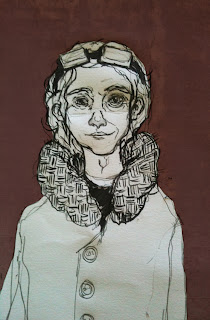
This is the final image for Gabriel Garcia Marquez' One hundred Years of Solitude. It's the second of the three book covers i did last year for uni and by far my favorite. I think i was over complicating my covers on the other two. With this i'd ran out of time and just had to go right ahead and produce it. So with very little design work i decided to draw a portrait of the author, who looks a lot like the character i was originally trying to capture in my head.
I'm looking for an aged looking acion hero for the project i'm working on at the moment which brought me to Peter O'Toole. What a legend. he has such a good life story, well worth a read!
Hello! i haven't posted for a while so i thought i'd make a quick update, i now have a twitter account;
I was having a bad drawing day the other day but was feeling creative so i routed through some old sketchbooks and cleaned this old character design up. (above left)
so if you're on here and don't follow me over there now you can!
Below on the right's a quick self portrait drawn completely digitally on my new Motorola Xoom tablet which is still quite tricky to draw on but i just haven't got used to it yet, there are some great examples of work generated straight from them.
Below on the right's a quick self portrait drawn completely digitally on my new Motorola Xoom tablet which is still quite tricky to draw on but i just haven't got used to it yet, there are some great examples of work generated straight from them.
I was having a bad drawing day the other day but was feeling creative so i routed through some old sketchbooks and cleaned this old character design up. (above left)
That's all for now - started uni again so i'll scan some work up soon!
This is an image used for animation i did last year, i found the original scan the other day and thought i'd jazz it up a bit - the animation is below :)
"I wanted so badly to lie down next to her on the couch, to wrap my arms around her and sleep. Not fuck, like in those movies. Not even have sex. Just sleep together, in the most innocent sense of the phrase. But i lacked courage and she had a boyfriend and i was gawky and she was gorgeous and i was hopelessly boring and she was endlessly fascinating. so i walked back to my room and collapsed on the bottom bunk, thinking if people were rain i was drizzle and she was a hurricane."
I love this quote. Maybe I'll illustrate it, although it'll be hard to do it justice.
This is my current mock up for the outsider cover.
I'm still going to re-draw the back cover image, add a photo of Albert Camus and lightbox the front cover image into Ink + Bleach. Then, maybe, i'll be getting somewhere!
Side note:
Listening to last.fm radio tagged folk at the moment. loving it! a really good selection!
Listening to last.fm radio tagged folk at the moment. loving it! a really good selection!
These are some dodgy little portrait drawings that i used to practice with ink+bleach, as you can see the best one is actually the brush pen on the left. The middle is just a doodle with some watercolour tests (didn't work) and on the right is a Rotring Art pen with sepia ink which weirdly goes green, the lines disappear and then you're left with this quite nice yellow ochre colour.
This is a larger bleach test drawing, i used all sorts of crap on here just testing how it reacts to the bleach.
This is a rough design for the back cover of my Albert Camus book sleeve. This is the sort of colour scheme i want, quite desaturated. Ignoring the fact that he looks a bit like a zombie i was trying to make it look like he is emotionless or drained - i pretty much feel how he looks most of the time which in theory should help me to draw that flat emotionless look: it didn't. I now have about four portraits of zombies with badly drawn mouths.
not technically illustration related but worth a post nonetheless!
my friend sent me this today and it is hilarious, i have to meet this pimpin' child.
my friend sent me this today and it is hilarious, i have to meet this pimpin' child.
"What struck me most about their faces was that I couldn't see their eyes but only a faint glimmer among a nest of wrinkles."
Albert Camus - The Outsider
(some experimentation for my book cover work)


